Tuesday, June 5, 2012

My mentor photographer: Cindy Sherman


Cindy Sherman is an American photographer and film director, best known for her conceptual portraits. Through numerous series' of work, cindy has always challenged her audience to question their initial thoughts and reactions to everything they forget to give a second thought to. It's by looking at her brilliant photographs, that we dig deeper into our minds and realize how quickly we create stories to her photos that have no real prologue to them, and where we got our ideas from. But that of course, was her artistic intention all along. I love this women, but I love her work even more. 
Her famous series of work, titled (but in a sense, not) "Untitled Film Stills", she is drawn out as a feminist, whether she assumes the label or not. What makes this series so brilliant, is the same reason why I chose Cindy as my mentor. In this collection of 69 black and white photographs, we see movie stills, from movies that in fact don't exist, and never have. That being said, we're convinced we've seen these in movies, because the photographs are inspired from 1950's and 60's film noir and European art house films.
Cindy Sherman wanted to get this idea across to her audience. She wanted people to question what they were looking at. I think, and proably so did CIndy, that we don't question our pre-assumed notions quite often. We are a combined effort of everything we've ever seen, felt, or heard. Each photograph is an apparent moment from a bigger, implied narrative. However, this implied narrative is both the viewer's, and Cindy's creation. Our preconceptions are based on what we have learned from female roles in pop culture. Based on our experiences of what women are like in movies, and the stereotypes that followed women in the 50's and 60's, we have unknowingly absorbed signs and imagery of popular culture that affects our judgement of what is real. Cindy wanted to force the viewer into coming up with their own interpretation by the fact that she left everything untitled. She ideally wanted people to question whatever preconceived notions they made have about a particular scenerio, about a character. She challenged us to think outside of what movie culture has molded our judgements into. 
Using cinematic techniques like lighting, scenery, props, framing, and leaving the images untitled and unnumbered, just as a promotional movie still would be, the notion of informed movie culture is reinforced. 
In the photo I took in which I mimicked Cindy's artistic intent, I wanted to challenge my audience to find a story of their own. While she tackled the 50's and 60's, I wanted to incorporate our generation of 2000-2012 into my photo, while maintaining the movie feel. I want you to break out of your pre-consumed notions and find a story of your own to feed this photo. I found my inspiration through this world renowned photographer, and that's why I love Cindy Sherman. 

Monday, June 4, 2012

Taking a picture of taking a picture, acrylic gel medium style


The last alternative process I did was a gel medium. For this assignment, I picked this photo simply because of the tonal variations, figuring it would look neat with this process. This took the longest to make, with a total of 20 layers, but it's definitely more durable than a picture on paper. I like the way I can wrap this around something and it can change you see it. I was initially inspired by the architecture in the background, as I've always been in love with the old buildings downtown. Not to mention, I went to an art gallery that day so I felt inspired to take pictures. When I got my film developed, and this picture came out, it automatically became one of my favorite in the set. Who doesn't want a favorite photo to be on a durable, handy result of gel medium. 

Tuesday, May 29, 2012


For my second alternative process, I chose the fancy looking cyanotype. This photo was taken in Greenwich Village where I've always been in love with the architecture and feel of this little part of the city. Picking the photo was easy, and then I had to pick my process, so naturally I wanted to use my favorite picture for one of my favorite processes. The final result takes away the natural look of a new york city building and leaves you with a colder toned, wonkier photo. When you look at buildings in New York City, you look at certain characteristics that aren't very common anywhere else. The way the arches of the windows are white, and the fire escapes much the same, highlights the infamous structure and content that makes this city's buildings so unique. 

Sunday, May 27, 2012

If you obey all the rules, you'll miss out on some fun


This photo project was to go against the basis of all other projects, and break the rules of composition. 
For the first photo, the entire subject is not in the frame, creating a merger. Another merger happening in this, is the cloud behind the torch that Lady Liberty is holding, creates the illusion of smoke rising out of it. 
In the second photo, the center of focus becomes the railing in the middle, although it's Jen that is really our subject. Another distracting factor are the two doors that fit perfectly in-between the railing. I like the distorted feel of this picture, courtesy of a fisheye lens and positioning myself accordingly. The fact that my subject (Jen) isn't drawing any attention to herself, by putting her head down and hiding her face, tearing the focus away. Yet another composition rule broken. 
In the third picture, well, where is the focus?! Your eyes are drawn to Jen, and back to the glistening light coming from the door and back to Jen. I've also distorted the perception of how far away the door is. Looks far away to me, but is it? I didn't break the rule of thirds, but it's as if I've taken it into account twice. The door, and my subject are both within the rule of third boundaries, but that just splits your focus in two. Snap.
As for the fourth picture, well, rule of thirds went out the door. 
And surely enough, for my last picture. The door is blocking jen, so she's become a merger. She's also centered. Adios to rule of thirds. My hand is another thing that draws your eyes away from Jen, giving you a feel that this just isn't balanced. And the direction of the door and the baseboards, and even the tiles on the floor, and the light, are all drawing your eyes to the doors behind Jen. Au revoir to the composition rule with lines. And in all the chaos of the photo, you still get this decisive moment where we're all left to wonder why all of this is happening, and to question it. And I think that the photos we take should do that. 

Hugh Johnson thinks no two gardens are the same, perhaps that goes for photomontages too.


The first in my series of alternative processes is my photomontage. I'm not much of a gardener so in the spirit of good weather, I made my own garden, darkroom style. I wanted to follow on the quote by Hugh Johnson, that no two gardens are the same. Using a rake (adjusting my enlarger), and some gardening gloves (adjusting the timer accordingly through experimentation) I discovered that all this junk I had gathered for my photo could be shuffled together to look like a fancy area for vegetation. On the right of both pictures, using a photo reel and clothes pins I made a windmill that is in motion and blowing the flowers petals out of one flower. With just my luck, it appears as if the direction of the wind doesn't really match with the direction that the flowers are blowing BUT this actually gives off the idea that the windmill is further behind from the flowers therefore blowing them in the proper direction. To make more sense of what I just said, basically it makes the windmill look like it's behind the flowers instead of beside. On the right there's like motion blur under the photo reel convincing you that it really is windy. Then we've got my snake ring and that little guy is really just playing himself in this. What's even better is that one of the flower petals looks like a bird on the montage to the left. He's waldo. Where is he?!?

Thursday, April 26, 2012

Jen in the Renaissance

        
          Beginning in the 14th century and stretching itself until the 17th century, was a cultural movement across Europe, that changed the way we express ourselves entirely. This era is known to us as the Renaissance, which really means "rebirth", or "reconstruction". During this time, artists and musicians produced works that displayed more artistic freedom and individualism. Among those who found their sense of who they were in their masterpieces was a man named Raphael.


Raffaello Sanzio da Urbino, born on April 6 or March 28, 1483 – April 6 1520, or better known as Raphael, was an Italian painter and architect of the high Renaissance. He is credited with revolutionizing portrait painting because of the style he used in the portrait of Julius II. In his painting The School of Athens, he reflected the classical influence upon Renaissance art, but he also paid tribute to the men who inspired him by using the faces of da Vinci, Bramante and Michelangelo as philosophers participating in the debate between Plato and Aristotle. Raphael was known as the genius of high Renaissance painters. He was the greatest designer of the Renaissance. Raphael influenced painters up to the 1900's. He made people think of personality when they looked at his paintings. Raphael put realistic emotions on to paintings. He changed the way people look at art. Raphael painted life. He was thought to be one of the most detailed painters of all portraitists. He also changed the way people thought of the Holy Madonna. He painted emotional themes. In the simplest of terms, Raphael changed the art world.


         Not only do we credit Raphael as having a long lasting influence on generations of artists after his time, but to the entire Renaissance era itself. The rediscovery of classical world radically altered the art of painting. By the year 1500, the Renaissance revived ancient forms and content. The spiritual content of painting changed - subjects from Roman history and mythology were borrowed. Devotional art of Christian orientation became classically humanized. Classical artistic principles, including harmonious proportion, realistic expression, and rational postures were emulated. Renaissance artists painted a wide variety of themes. Religious altarpieces, frescos, and small works for private devotion were very popular. he rebirth of classical antiquity and
Renaissance humanism also resulted in many Mythological and history paintings. The Renaissance era also heightened oil painting techniques, and had almost completely replaced tempera techniques in the majority of Europe. 


         The Renaissance was a point in time where art was bursting with innovation and society's knowledge was quickly expanding. With the invention of the printing press by Johannes Gutenberg, literacy ratea greatly increased because of the lowering cost of books and more ways to get difference points of view on a certain idea or event. With the learning of how to read and write, common people also started to write their own books and increased the education rates by far causing to people to revolt against the current society they were having. As for the artwork, it changed society's view of beautiful. Kings and queens were painted as pale with no eyebrows, and with a reddish colored hair to from this as a standard for beautiful. The Renaissance gave the world beautiful churches, monuments and castles. It was a golden era filled with brilliant minds like Petrarch, Raphael, Michelangelo and Leonardo da Vinci. Some of the most prominent works of this era was the Mona Lisa, St. Peters Basilica and the sketches of Da Vinci’s flying machines. 


        The Renaissance period represents a cultural rebirth, that we see change through these brilliant minds who used ideas like religion and new techniques (just to name a few), as reasons to create masterpieces that changed the way we saw the world. In this era, Europe witnessed an astonishing revival of drawing, fine art painting, sculpture and architecture, that changed the art world forever.


Thursday, April 12, 2012

"Splashed fix in your eyes? Wash it out with light!"

So for this week's studio lighting photo, I thought I'd give painting with light a shot (and cause the darkroom wasn't occupied...). I went in without an ounce of inspiration, so I just played around with the shutter speed and a tiny little flashlight that looked more like a flying saucer. So I set my shutter speed to "30 at first and just sort of played around, experimented, and spun in circles and such. Any-who, after playing around I just sort of walked over to the eye washing station and set up my tripod and Nikon D300 with an aperture of f-29 and a shutter speed of 30 seconds, using my hand held light source, being a tiny flashlight, and I pretended to make it look like water was spurting out of the machine like it was on a mission to wash out a billion eyes. Yeah, so turns out I really liked it, and how it emphasized the normal activity of the eye washing station, illuminating it, and gave it life/action while being off. I kept the black area around to give the subject a glowing effect and show the contrast. Oh and I almost turned it on while doing this (sacrifices, sacrifices).

Monday, April 2, 2012

Mixing things up, (two light sources at a time)

For this particular week, I shot a big ole wad of mixed lighting photos. I chose this one with my blog post in mind. When talking about my inspiration, I mentioned wanting to take pictures that drew people into my subject and have them wonder about what went out when this photo was an actual moment in action. I love the way the natural light brightens her face and draws you straight to her darting blue eyes. That in mind, I didn't want to draw your attention to her eyes only, and have you miss the photo as a whole. That's why using a reflector, (and I'll admit, accidently) the light hit the bottom light of the tree, and her hair, giving color the her hair and drawing your eyes more to her as a subject entirely, adding shadows, and not just focusing on specific facial features. I love that the lighting on the bottom left of the tree trickles and leads into her hair, so evenly. Not to mention, I'm glad her genes gave her eyes that color because they went so nicely with the colors of her shirt. This was shot using a Nikon D300, with a shutter speed of 1/250 and an f-stop of 4.8. Credit to Jen for tackling the obstacle of this womping willow to nudge herself into the nook of this tree.

Friday, March 23, 2012

Looking All Fancy in Studio Lighting


For my studio lighting project, a couple of yawns caught on camera and a hell of a lot of rearranging lights, and I finally results I liked. I used Andie as my model in all three pictures, and had her play around with faces and angles. Taking the first picture at the top for example. Using a Nikon d3100, with a shutter speed of 1/80, and an aperture of F-5.6. I set my lighting at a 1:2 ratio, and was of course, formally posed, using two studio lights. This one ended up being my favourite because I loved the way the light Andie's looking into sharpens the profile of her face, and her long hard is dark enough to contrast well with that. It has a classy, elegant look to it, unlike the other pictures I took of her with a little more freedom to make weird faces and poses. The catch light in her eyes gives depth to the photo, and draws your eyes in.
In the second photo, it was taken candidly, as the subject was just making different faces at the camera, and I decided not to tell her when I was going to take the picture. For this one, I used the Nikon D3100, with a shutter speed of 1/80 and an aperture of F-5.6. I love the way her hair against her arm contrasts, as well as with her face. I had a light closer to her on the left, and farther away on the right, as you can see through the darker shadows on the right.

For the last studio lighting picture, using a Nikon D3100, with a shutter speed of 1/80, and an aperture of F-5.6, I let Andie play around (with her hair apparently), and shot candid pictures while she did so. I used two studio lights, the one on the left is once again stronger, because I set it closer than I did with the one on the right, but I did it so that you could hardly tell, because I wanted her entire face to be lit similarly. I love the contrast between her eyes and her fancy strand of hairstache.


Monday, March 19, 2012

Finding My Name In Unexpected Places


For this project, we were to find our name in abstract places, spelling it out letter by letter, first to last. It was most definetely something that got easier as I went along. To find the letters of my name is unexpected places, I had to think outside of the box, and get out of my own head. In order to get creative with this, I had to see beyond an object itself, and look at the detailing for something beyond what it actually is (what is really not as deep as I made that sound). Through this, I discovered that through the use of lighting, angles, and editing, we as the photographers have the power and control over what we want our viewer to see. We can make our viewer see something through our perspective. For example, I took a clock, and made you see it as an "L". We can convey messages and show things to our audience by getting out of the box and forcing them to look at things differently, as we had to.

Thursday, March 1, 2012

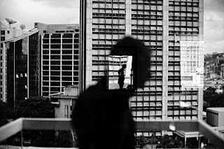
VENEZUELA. Caracas. 2006. Reflection in window in Altamira.

My photo inspiration for grade 11 photography is none other than Christopher Anderson. Born in British Columbia in 1970, Christopher Anderson spent much of his early years in Texas, where his father was a preacher, before moving to New York City, and then Paris (so he's most definitely had his share of exploring the planet). His life in photography began in the photo lab of the Dallas Morning News, where he learned to develop film and print pictures. Along with now working in black and white, Anderson was honored with the Robert Capa Gold Medal Award. Later that year, he photographed the stone throwers of Gaza and was named Kodak's Young Photographer of the Year. In 2003, he published his first monograph, Nonfiction, later publishing Capitolio.

Aside from the fact that his photos are super
intriguing, Christopher Anderson eloquently gives you something to look at, and another thing to think about. Anderson gets out of an office or a kitchen, or any room that I've seen more times than my own reflection. He gets out into the world and shoots pictures that tell a story that people need to see. The first thing that comes to mind when I see a photo by Christopher Anderson is that there's such raw emotion and passion in his shots. His photos of the stone throwers inspired me to take pictures that move people. I think he has a strong drive to show things like that to parts of the world that don't get to witness things like that on a daily basis. He shot several photos in Caracas, Venezuela that showed you emotion and pain in the faces of the people, that gave you a strong sense of the poverty, political power, and negative influence on the area. Yep, that's my inspiration.